- Автоматизация
- Антропология
- Археология
- Архитектура
- Биология
- Ботаника
- Бухгалтерия
- Военная наука
- Генетика
- География
- Геология
- Демография
- Деревообработка
- Журналистика
- Зоология
- Изобретательство
- Информатика
- Искусство
- История
- Кинематография
- Компьютеризация
- Косметика
- Кулинария
- Культура
- Лексикология
- Лингвистика
- Литература
- Логика
- Маркетинг
- Математика
- Материаловедение
- Медицина
- Менеджмент
- Металлургия
- Метрология
- Механика
- Музыка
- Науковедение
- Образование
- Охрана Труда
- Педагогика
- Полиграфия
- Политология
- Право
- Предпринимательство
- Приборостроение
- Программирование
- Производство
- Промышленность
- Психология
- Радиосвязь
- Религия
- Риторика
- Социология
- Спорт
- Стандартизация
- Статистика
- Строительство
- Технологии
- Торговля
- Транспорт
- Фармакология
- Физика
- Физиология
- Философия
- Финансы
- Химия
- Хозяйство
- Черчение
- Экология
- Экономика
- Электроника
- Электротехника
- Энергетика
Write a report for a university lecturer describing the information shown in the diagrams below.
In April 2006, an experimental flu vaccine was trialled on females in a large town. The graphs outline the effect of this vaccination in this town.
Write a report for a university lecturer describing the information shown in the diagrams below.
Write at least 150 words.
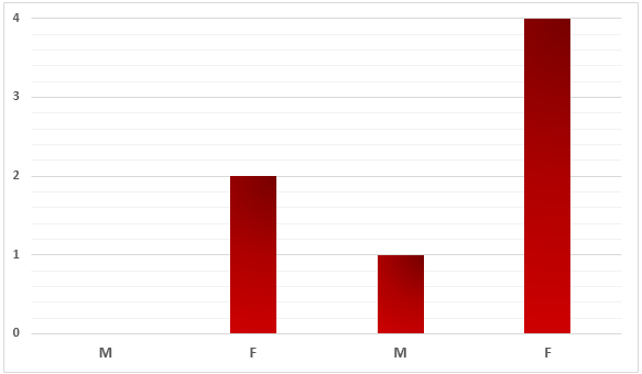
Number of Deaths in 2005 - 2006
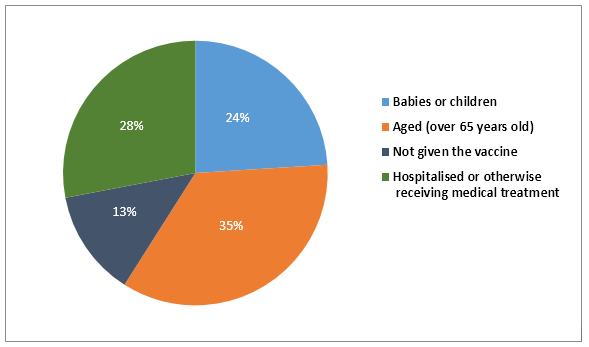
Percentages of complaints recorded after the vaccination
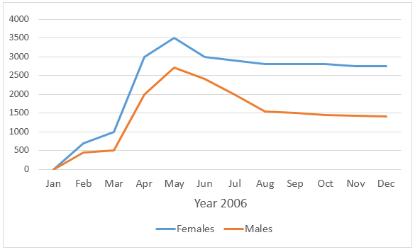
Flue Rates for Males and Females
Sample Answer:
The bar graph shows the number of deceased people in a town in 2006, the year when a flu vaccine was trailed, the pie chart presents the ratio of complaints from different patients due to vaccinations and finally the line graph outlines the flu rates among people in this town throughout the year.
According to the bar graph, 2 females died in the town in question in 2005 while no male death was recorded in this year. In 2006, the year the flu vaccine experimented on females in this town, 4 women passed away. However, a male also died in 2006.
The pie chart reveals that the highest percentages of complaints (35%) came from the elderly women (over 65 years). Almost a quarter of the total objections were related to adolescents and 13% related to women who were not given the vaccine. 28% of those objections were made by people who were under medical treatments.
The line graph shows that the flu rate among females was higher throughout the years. In March 2003 around 1000 females suffered from the flu while this was exactly the half among men. After the vaccination in April 2006, the flu cases actually surged. In May 2006, 3500 females had some kind of flues while just over 2500 men suffered from it. After August, the number of cases stabilized but was higher than the earlier of the year, around 2750 cases for female and just below 1500 for men.
|
|
|
© helpiks.su При использовании или копировании материалов прямая ссылка на сайт обязательна.
|